The Ultimate Website QA Checklist
Save time and sanity by following this website QA checklist. From broken links to font issues, we've got you covered!
QA can be stressful.
When you finally ship that new website, it needs to be perfect.
But with all the moving pieces involved in a web development project, it’s easy to get overwhelmed as a tester:
- All copy must be compelling, grammatically correct, and SEO-optimized
- The website must be responsive and work on all browsers
- No broken links
- Structurally sound
- Visuals are clear and compelling
- …and dozens more.
There are just too many things to remember!
That’s why we made this website QA checklist.
Our goal with this page is to help you go through a round of QA as quickly and efficiently as possible—whatever the project is.
And if something isn’t clear, we’ve included a small “how to fix” section for the most common issues you might encounter while doing QA.
Happy testing!
Website Quality Assurance (QA) Checklist
Follow this website QA testing checklist to ensure your website is free of bugs—and provide the best user experience for your visitors.
1. UI and Design Testing
First impressions matter! Designing a website that expresses the brand’s identity and is enjoyable for visitors is no small feat.
What to look for:
2. Content testing
Sites riddled with spelling errors or poor structure will put off potentially valuable users.
What to look for:
3. Functional testing
Are your site's features working as expected?
You don’t want to give out the idea that “not even the website works properly”. Double-check that every feature can be interacted with.
What to look for:
4. Accessibility testing
Is your website usable by people with disabilities?
About 15% of the world lives with some form of disability (hearing, visual impairment…). Make sure they can use your website, too.
What to look for:
5. SEO testing
Is your website ready for search engines? Do all pages have clear titles, URLs, and meta descriptions?
Do basic optimizations and conduct a strong website analysis from the get-go to have your website indexed by all major search engines.
What to look for:
6. Responsive & cross-browser testing
Does your site work on all devices and operating systems?
Your site should be easy to navigate on any device: desktop computer, laptop, phone, and other mobile devices.
You should also take this opportunity to verify browser compatibility.
What to look for:
7. Security testing
Is your website secure? Are there any blatant vulnerabilities?
Make your visitors feel at ease and prevent website attacks.
What to look for:
8. Scripts, snippet codes, widgets, and plugins
Is your website connected?
All tracking, marketing, and analytics snippet codes should run smoothly.
What to look for:
Congratulations on making it through our website QA checklist—your site is now ready for live!
Common oversights and how to fix them
In this section, we’ll have a look at some of the most common oversights when doing website QA—and quick tips & tricks on how to deal with them.
When designing websites, consistency is king.
For large projects, you’ll typically follow a web design style guide. This helps your team stay aligned on stuff like:
- What fonts and colors to use
- Icon style
- Brand voice
- etc.
A few extensions make this part of QA a little easier:
- DebugCSS: to verify layout and what elements cause misalignment
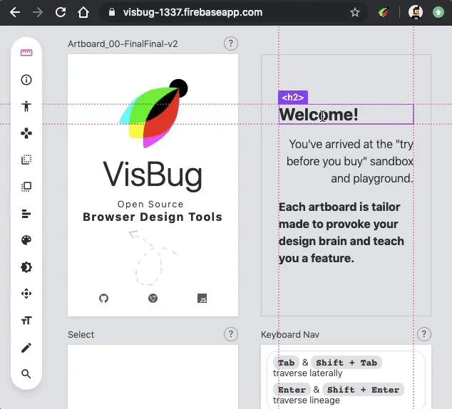
- VisBug: edit, style, and tinker with any page, in any state—and inspect elements more closely
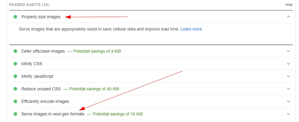
All images should serve a clear purpose. The goal of an image is to make it easier to scan a website, not add more fluff.
Needless to say that they should load fast, too.
The best practice for this is to serve highresponsive images in a modern, high-quality format.
Since not all browsers support these next-gen formats, it's also your responsibility as a QA to ensure they are visible on every device.
The good news? Google PageSpeed Insights performs these checks for you. No need to manually verify every single image.
And if you want to analyze multiple pages at once, I recommend Experte. It's basically the same thing as Pagespeed—except you can do it in bulk, too!
Grammatical and spelling errors can put off potential customers and make them distrust the brand.
This is an easy fix with Grammarly. We kill two birds with one stone:
- No grammatical mistakes
- Plagiarism check
Be particularly careful with images if you have any text on there. Grammarly doesn’t do OCR yet!
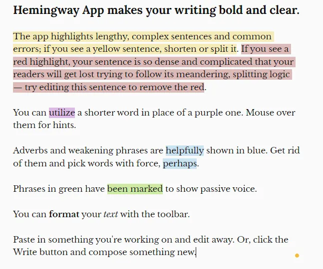
We also recommend Hemingway to help make your writing more concise and clear.
Invalid hyperlinks can confuse users, negatively affect your SEO, or cause critical security issues.
Because larger websites have hundreds (or thousands) of links, we recommend performing a site audit with Ahrefs.
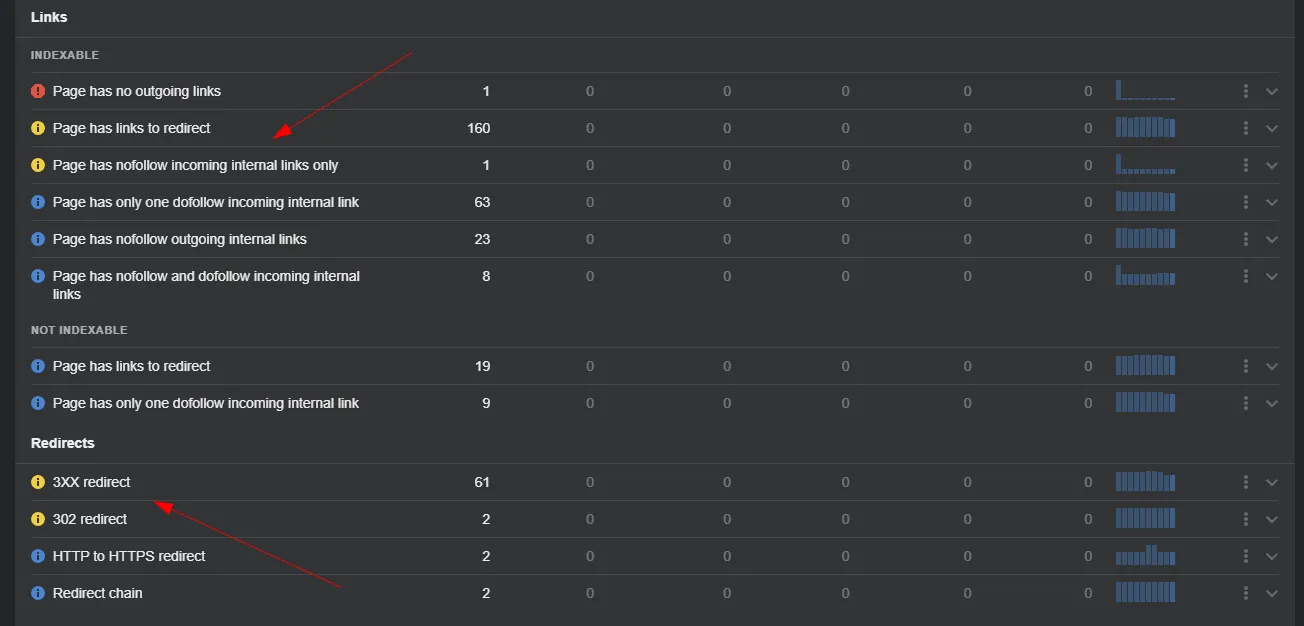
With this audit, you’ll get an overview of all links, which ones cause issues, how to fix them, and ensure full indexing of your website.
An alternative for this specific use case is the Chrome extension Link Checker.
Cookies ensure proper communication between web pages on your site (shopping carts, tracking codes, etc.).
Good cookie testing should verify whether:
- Your site remains usable if the user rejects cookies
- Cookies get corrupted
- Cookies have a proper expiration date
This is easy to do with the extension EditThisCookie.
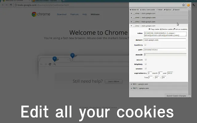
Test critical flows on your app or website:
- What happens if you suddenly disable or delete all cookies?
- What if you change their value?
For example, log on to your app, then delete all cookies and reload the page—and make sure you’re properly disconnected.
Here are a couple more accessibility tips & tricks.
Similar to our earlier tip, ”every visual should have a purpose”. Something to keep in mind during website design: the more fluff on your site, the harder it is for the visually impaired (and in fact, other end-users) to make sense of what’s going on.
Keep it simple and add:
- Alt tags attributes to images
- Labels to forms
- Text to links
- Clear, visible headings
Likewise, contrast should be top of mind when performing accessibility testing. Most sites are black on white for a good reason!
Finally, your website should have a logical structure that makes sense and is easy to navigate for anyone.
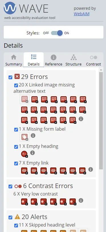
The WAVE extension helps a ton to identify and fix critical accessibility issues.
A logical internal linking structure means it’s easier:
- For users to navigate your website
- For search engines to understand and crawl it
For larger sites and e-commerce in particular, structuring a website into categories that make sense is paramount.
As a QA, your job here is this:
- Ensure URLs make sense and always tell the user where they are. For example, awesome-store.com/men-clothes/shirts
- Perform several navigation tests. For example “If I wanted to find men's shirts on this website, where would I click first?”
Cross-device testing means making sure your users have a quality experience on your site, no matter what device they use to access it.
When testing different resolutions and browsers, here are some things to keep in mind:
- Text: is it still readable?
- Spacing and alignment: is it significantly harder to make sense of the structure on different devices?
- Scrollbars: avoid the dreaded horizontal scrolling
- Screen sizes and screen resolutions: does the website feel nice to use on any screen size?
With BrowserStack, you can test any combination of browser, device, or resolution. And they have a Chrome extension!
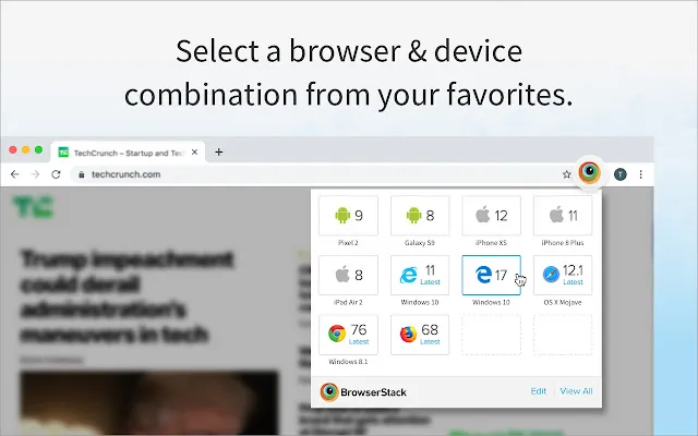
How to use this checklist to do quality assurance testing
This checklist works exactly as you’d expect. The testing process is: go through every category, perform the checks, then come back to this page and cross out the checkbox.
If anything’s wrong, you can use a bug reporting tool like Marker.io (that’s us!) to report issues in one click.
Let’s look at a few ways Marker.io is awesome for QA testing.
1. Perform an entire QA session without leaving your website
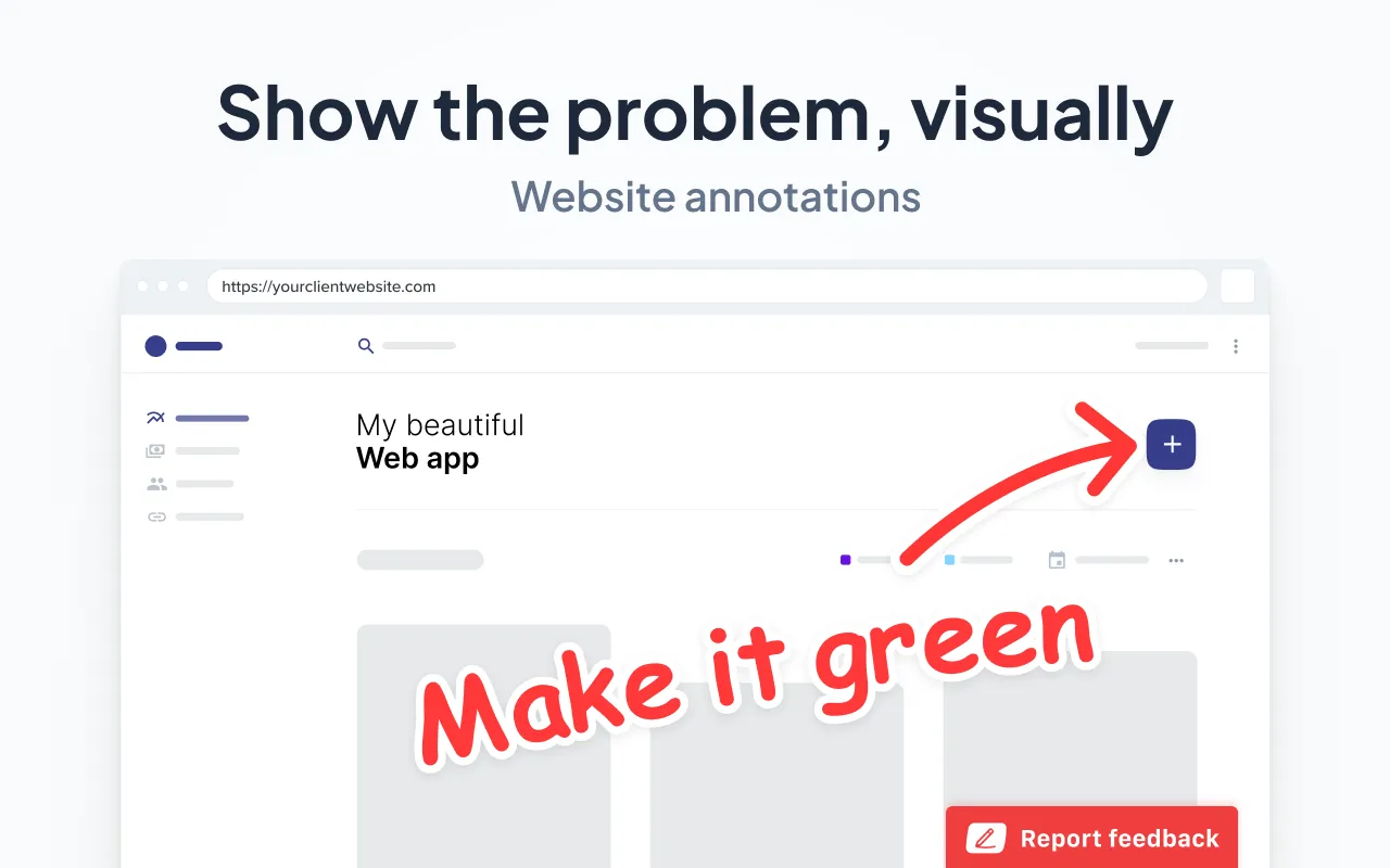
A QA session usually looks like this:
- Go to staging, find a bug.
- Open screenshot tool, capture bug.
- Open software to annotate screenshots and add comments.
- Log into your PM tool.
- Create a new issue.
- Document the bug.
- Add technical information.
- Attach screenshot.
- …do we really need to go on?
There’s so much back-and-forth and alt-tabbing… this used to drive us crazy.
So we built Marker.io.
Doing QA is now a simple, 3-steps process:
- Go to URL, and just click on “Report a bug”.
- Input details.
- Click on “Create issue”—done!
All issues reported will directly land into your PM tool. This means you can stay on the website for the entire QA testing session.
2. Data-rich bug reports
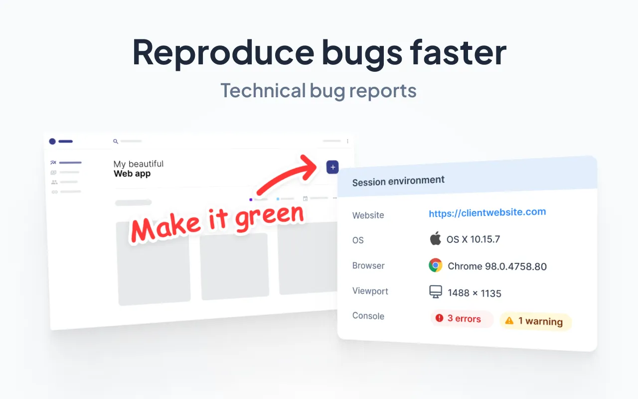
If you’re still manually typing in source URL, environment info, console logs, and others with each bug report, you’re wasting a ton of valuable time.
With Marker.io, you don’t have to worry about any of that. Every report sent with our widget (or extension) will capture this data automatically.
This includes a session replay as well: no need to record your screen anymore!
3. 2-way sync with PM tools
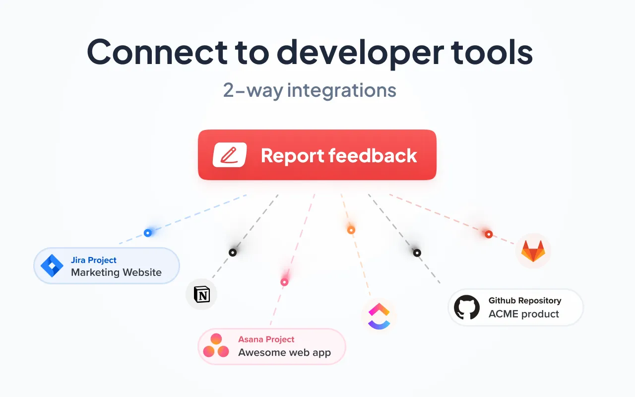
Finally, all issues and reports are synchronized between your PM tool and Marker.io.
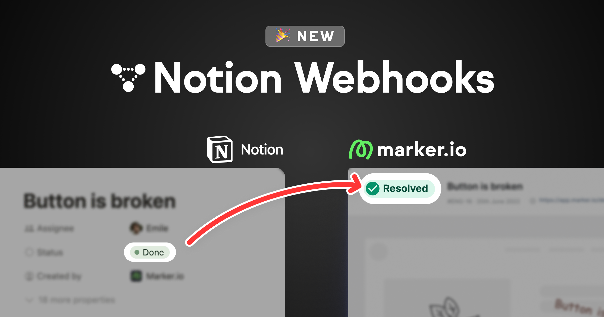
This means that if developers mark an issue as “Done” in Jira for example, it will be marked as “Resolved” in Marker.io as well.
Now you have an overview of all issues and their status.
Because comments are synced as well, you get to discuss each issue at length with your developers if necessary.
Sounds too good to be true?
We think so, too. Start your 15-day Marker.io trial today.
We’re trying to make this checklist the go-to reference when it comes to QA. So, if we missed anything, let us know and we’ll update it!
What should I do now?
Here are three ways you can continue your journey towards delivering bug-free websites:
Check out Marker.io and its features in action.
Read Next-Gen QA: How Companies Can Save Up To $125,000 A Year by adopting better bug reporting and resolution practices (no e-mail required).
Follow us on LinkedIn, YouTube, and X (Twitter) for bite-sized insights on all things QA testing, software development, bug resolution, and more.
Frequently Asked Questions
What is Marker.io?
Who is Marker.io for?
It’s perfect for agencies and software development teams who need to collect client and internal feedback during development, or user feedback on live websites.
How easy is it to set up?
Embed a few lines of code on your website and start collecting client feedback with screenshots, annotations & advanced technical meta-data! We also have a no-code WordPress plugin and a browser extension.
Will Marker.io slow down my website?
No, it won't.
The Marker.io script is engineered to run entirely in the background and should never cause your site to perform slowly.
Do clients need an account to send feedback?
No, anyone can submit feedback and send comments without an account.
How much does it cost?
Plans start as low as $49/mo per month. Each plan comes with a 15-day free trial. For more information, check out the pricing page.
Get started now
Free 15-day trial • No credit card required • Cancel anytime


